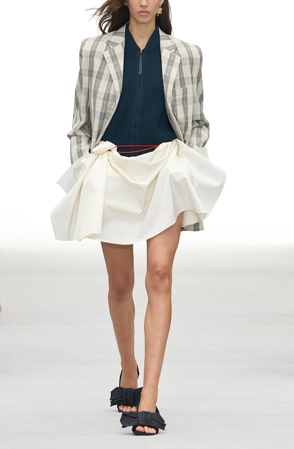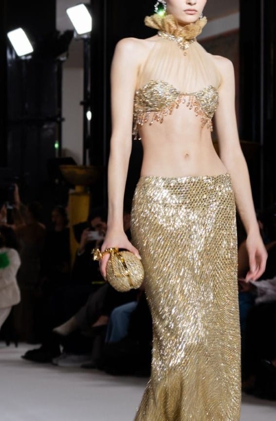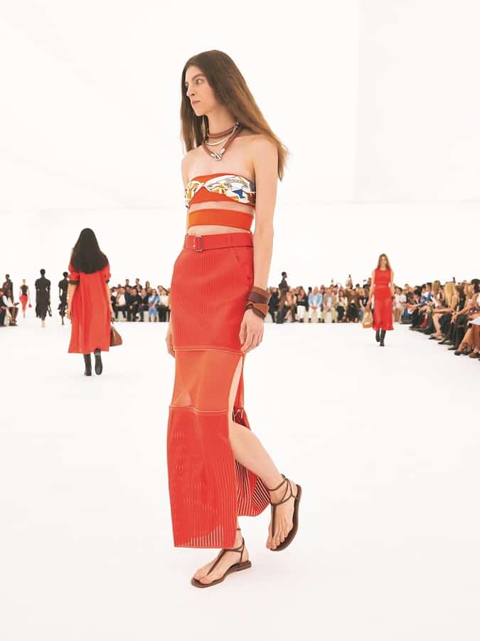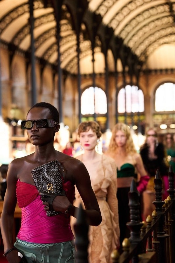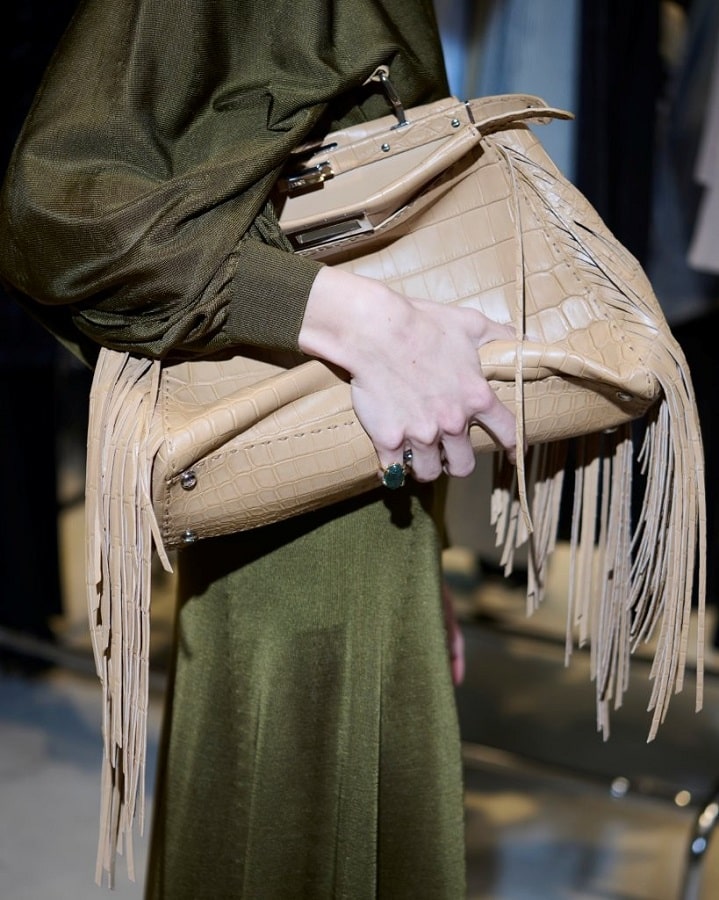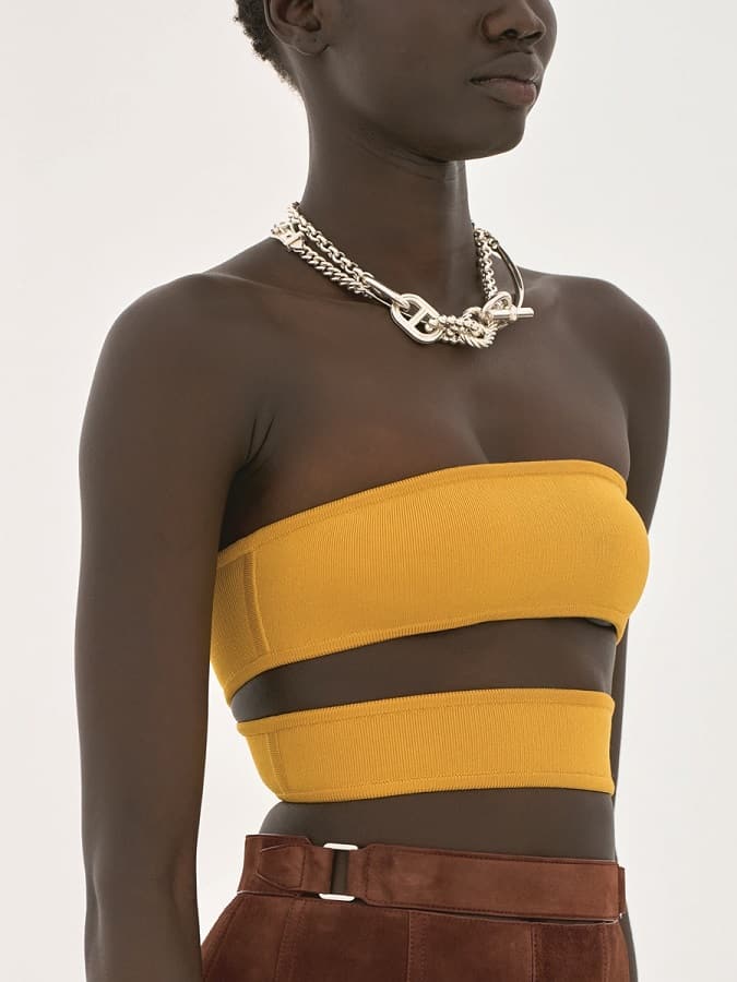
For a while, it felt as though fashion had fallen in love with restrained colors: plenty of beige, shades of white, grey and black. This shift was not only about color. It also reflected a simpler approach based on buying fewer clothes and focusing instead on practical, high-quality pieces, reflecting what came to be known as “quiet luxury” or “minimalist elegance.”
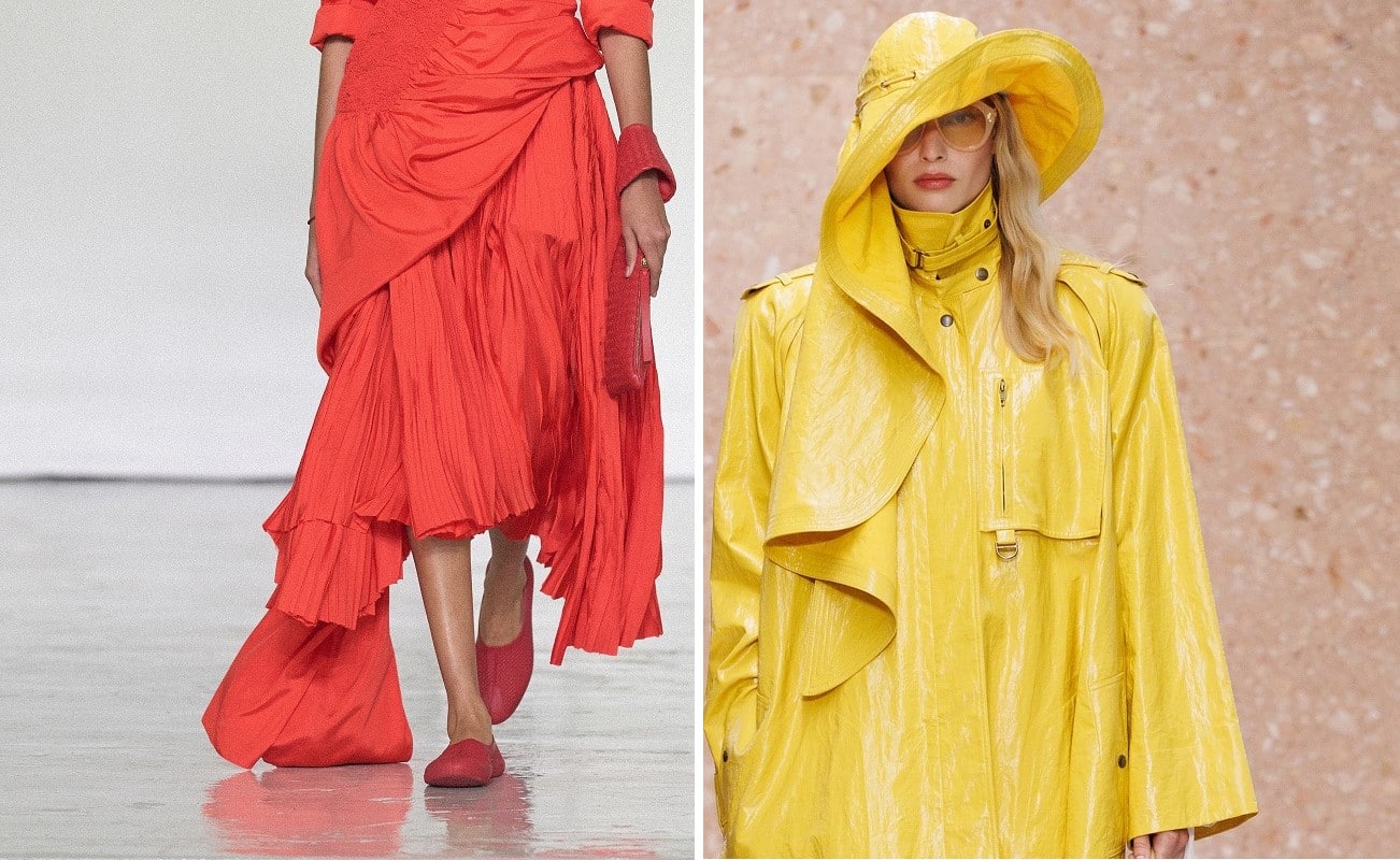
Image1: Courtesy of Bottega Veneta, Image2: Courtesy of Chloe
But on the Spring/Summer 2027 runways, it felt as though fashion’s key players had grown tired of strict monochrome palettes and decided to go against the current, introducing a completely different idea: what if getting dressed could be about having more fun?
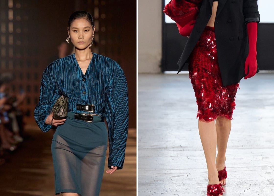
Image1: Courtesy of Ferragamo, Image2: Courtesy of Elisabetta Franchi
So how did they express this idea? They sent models down the runway dressed in striking palettes, with plenty of yellow, orange, green, red and fuchsia. Think of any strong color and you will probably find it somewhere in the Spring/Summer 2027 collections. But color was not used simply to make an outfit stand out. It also played a key role in shifting the mood of the wardrobe, creating contrast and, at times, challenging the idea that everything needs to match. The result was clothing with personality and presence.
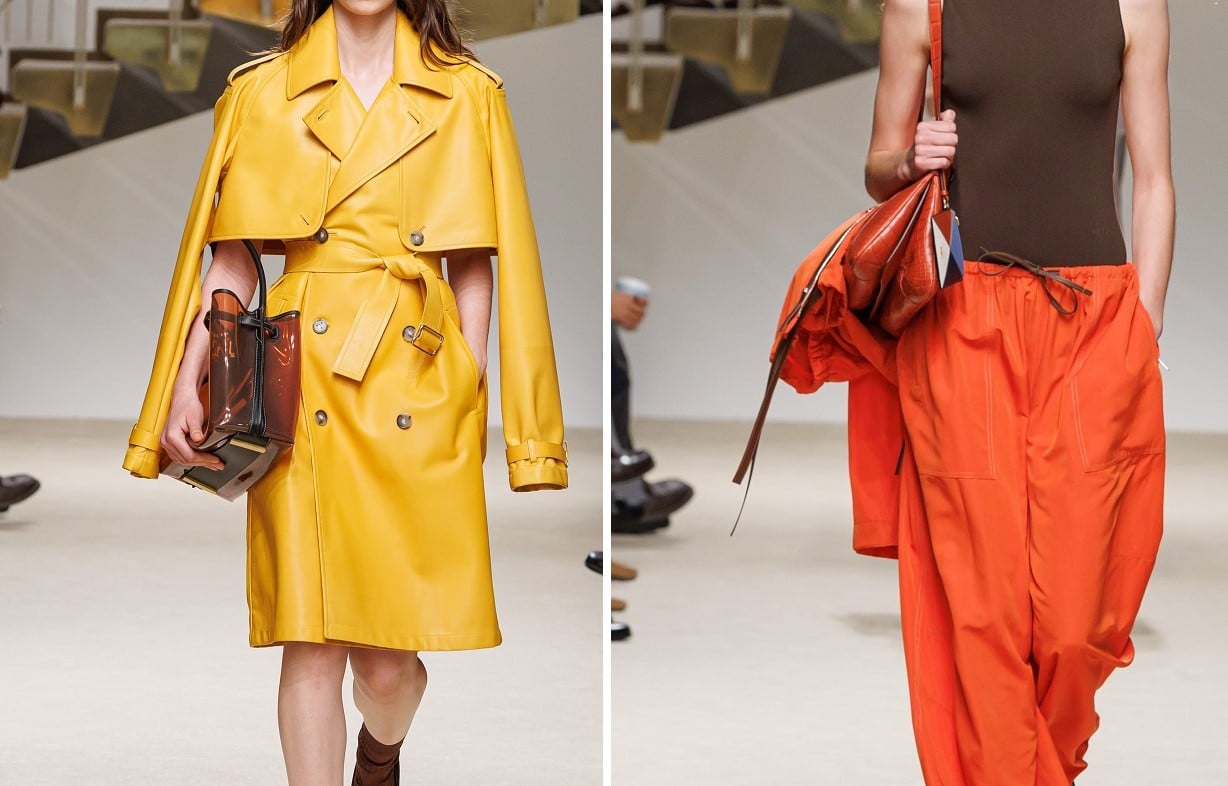
Images: Courtesy of Tod’s
At Tod’s, color appeared within a practical yet elegant wardrobe. The collection moved between familiar neutrals and bolder shades, including different tones of blue and warm red. This balance felt important, because the return of strong colors does not necessarily mean allowing color to take over an entire outfit to make an impact. Sometimes, a single unexpected shade is enough to make a look feel new.
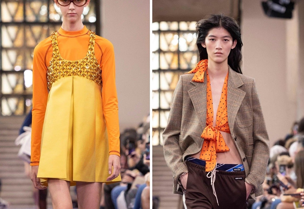
Images: Courtesy of Miu Miu
At Miu Miu, meanwhile, color seemed less interested in following rules. Grape, pink, orange, cobalt, yellow-green, red and gold appeared alongside sportswear, tailored suits and eveningwear. The aim was not to create perfectly coordinated outfits, but to bring together pieces that might not traditionally seem to belong together. This contrast is what gave the looks their individuality and personal character.
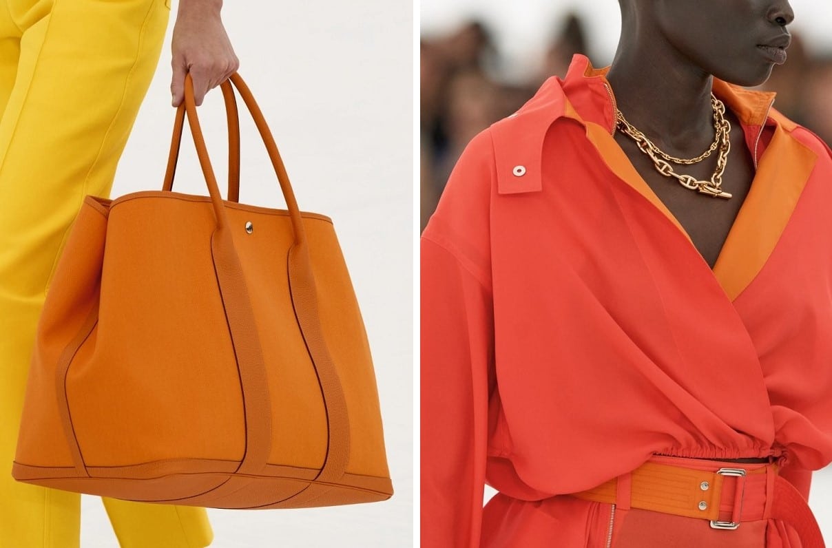
Images: Courtesy of Hermès
Hermès took a different approach. Its designs remained grounded in a calm palette of cream and natural shades, but vivid orange and floral yellow appeared as energetic accents on selected pieces, such as bags and jackets. To us, these touches of color felt like a useful reminder that a strong shade can give an outfit a surprising amount of impact, even when used sparingly.
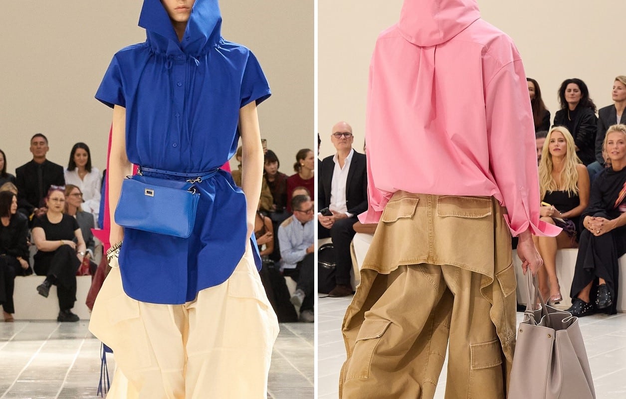
Images: Courtesy of Balenciaga
At Balenciaga, Pierpaolo Piccioli used color to soften the sharper image the house has become known for and bring a sense of joy to everyday clothing. The collection included shades of orange, soft pink, turquoise blue and other vivid colors alongside softer pieces. These colors felt like part of his attempt to reconnect Balenciaga with emotion, craftsmanship and clothes that people genuinely want to wear.
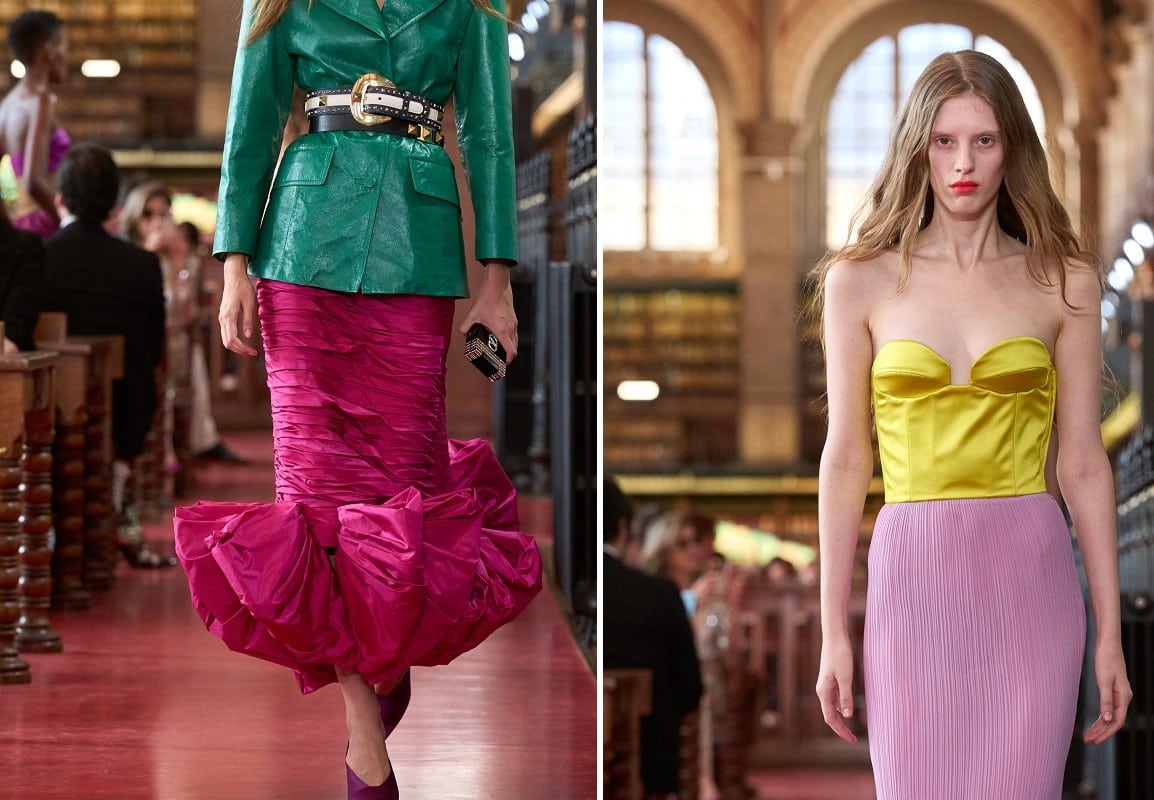
Images: Courtesy of Valentino
Valentino took the idea to its most expressive extreme. Alessandro Michele combined vivid pink with lemon yellow, purple, cherry red and green, often placing strong colors next to one another rather than toning them down with pastel shades. The result was clothing full of energy and a sense of “creative chaos.”
Perhaps this is the point of the return of bold colors. It may not simply be about adding vivid shades to our wardrobes, but about acknowledging that we have grown tired of the strict palettes that suggest a certain level of restraint and reserve. After years of quiet luxury and carefully curated wardrobes, there is something refreshing about wearing a color simply because it makes us feel renewed and alive. This does not mean beige has become a thing of the past, but it certainly will not be the only color we see everywhere next season.